If you are interested to know the basics of Color theory then you are in the right place. Color is powerful. The specific hues and color combinations used in designs, branding, art, and media elicit emotions and shape visual messaging. But how do we make sense of millions of possible color choices?
Cue color theory – a handy framework explaining how colors influence each other and viewers. Understanding basics like the color wheel distills color’s complexity into simple, usable principles for applying color effectively.
Let’s unpack the color wheel itself – theroot of all impactful color pairing. We’ll cover:
- Primary, secondary and tertiary hues
- Warm vs cool colors
- Complementary and analogous harmonies
- Contrasting and accent colors
Arm yourself with fundamental color relationships to intentionally tap color’s potential in any visual medium.

What is Color Theory?
Color theory is a body of principles defining relationships between colors – specifically, how human vision perceives color interactions. It provides a toolbox for color mixing principles, symbolic meanings, and aesthetic visual harmonies.
While Isaac Newton’s color circle from 1706 codified primary hues and complementary pairs, modern color theory concepts build on principles originating in the 18th and 19th centuries from inspiration like Goethe, Thomas Young, James Clerck Maxwell and later the Bauhaus school. These color theorists examined physics, optics, paint mixing, and the intricacies of human visual perception to systematize emotional responses to color combinations.
In practice today, graphic designers, artists, web developers, fashion specialists, interior decorators and more apply color theory to:
- Design cohesive brand palettes conveying specific symbolic meanings and moods
- Craft accessible, legible interfaces through compliant text/background color combos
- Identify colors that aesthetically harmonize together based on innate visual properties
- Understand cultural color symbolism across demographics and geographies
- Unify themes across diverse mediums like logos, packaging, websites and beyond through color schemes
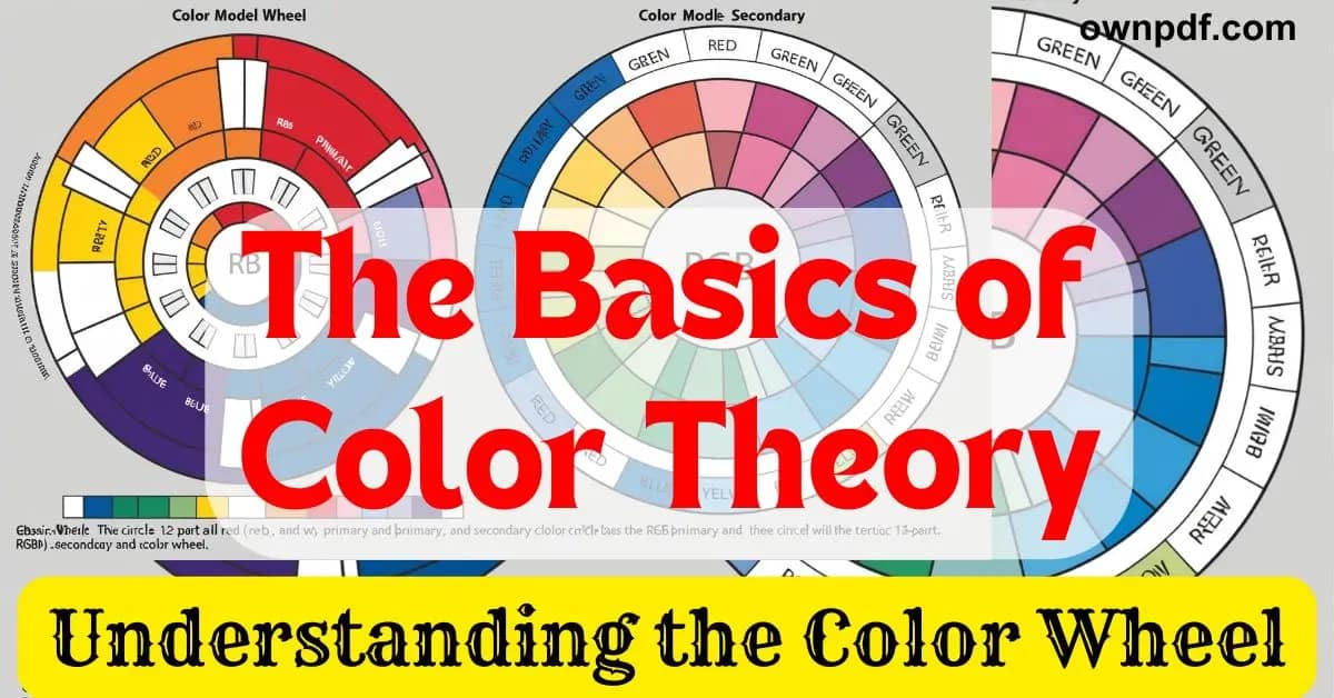
The Color Wheel Explained
The color wheel is a visual representation modeling color relationships based on human color perception. The most common form is a 12-part wheel featuring primary, secondary, and tertiary colors.
Primary colors are sets of colors that can be mixed to create all other colors. In subtractive color mixing (with paints/pigments), the primaries are red, yellow, and blue. In additive color mixing (with light on screens), the primaries are red, green, and blue (RGB).
Secondary colors are created by mixing equal parts of two primary colors next to each other on the wheel. Red and yellow make orange, yellow and blue make green, and blue and red make violet/purple.
Tertiary colors are made by mixing a primary and secondary color side-by-side, like red-violet and yellow-green. Further mixing creates intermediate hues.
Split complementary schemes incorporate a color plus the two hues adjacent to its complement for vibrant trios.
Beyond exact hues, color theorists also examine qualities like:
- Shade: How light or dark a color is
- Tone: How bright, dull or grayed a hue is
- Temperature: How warm or cool a color feels
Psychologically, warm colors like red, yellow and orange feel energizing, friendly and advance forward while cool blues, greens and purples feel calming, professional, and recede backward.

Using Complementary Colors
Complementary colors are color pairs located directly across from each other on the 12-part color wheel.
Some classic complementary pairs include:
- Red & Green
- Yellow & Purple
- Blue & Orange
These contrasting color combos create a vibrant, energetic look when placed beside each other in designs. The opposing hues play off one another for maximum visual tension due to the stark differences between them.
Creative Uses:
- Maximizing color contrast for focal points
- Making key elements like call-to-action buttons “pop”
- Adding excitement for youthful brands
- Bringing an abstract composition together through strategic color unity
However, going overboard with high saturation primary complements can strain viewers’ eyes. Best practice tips:
- Use lighter, desaturated complementary tones as main colors
- Reserve highest saturation complements for accents
- Balance with white/black spaces for relief
- Ensure text legibility between complements
Analogous Colors
Analogous colors are groups of three or more neighboring hues on the color wheel.
Some examples:
- Reds, oranges, peaches
- Greens, teals, blues
- Violets, magentas, pinks
Analogous palettes create a smooth, cohesive look as the hues naturally transition between each other. Great analogies evoke themes like sunsets, forests, jewel tones, and more based on the colors used.
Mastering analogous combinations involves:
- Choosing one dominant anchoring color
- Adding enough hue variance for interest
- Limiting the scheme to 2-4 colors for unity
- Using tints and shades for contrast
- Trying smooth gradient transitions
Analysts praise analogous palettes in interfaces for clarity and usability. Brands like Instagram and HP feature analogous tones balancing vibrancy with professional accessibility. Further, industries like food and hospitality leverage analogous warmth.

Triadic Color Combinations
Triadic color schemes feature three hues spaced evenly around the 12-part color wheel, forming a triangle.
Classic triadic examples include:
- Red, yellow, blue
- Purple, orange, green
- Magenta, lime green, cyan
The evenly distributed trio creates vibrancy through maximum diversity – combining high contrast and energy comparable to complements yet with slightly more harmony.
Expert tips for triadic success:
- Select one dominant triad color
- Lighten tones for majority of scheme
- Use purer hues in restricted accents
- Add white, black and gray for separation
- Limit to one vivid triad per overall composition
From warning signage to toy store displays, triadic combos grab attention in youthful, energetic contexts by playing edges of contrast against harmony for dynamism. Brands like NBC, ABC and Campbell’s harness attention-grabbing triadic abilities.
Tetradic and Square Color Schemes
Tetradic color schemes (also called double complementary or rectangle color harmonies) use four hues from the color wheel configured into a rectangle.
Some tetrad examples include:
- Red, green, blue, orange
- Violet, yellow, green, red-orange
- Magenta, cyan, olive, gold
Balancing multiple colors effectively takes skill – tetrads seem easy at first glance but require planning to shine. However, well-executed tetradic palettes create captivating compositions full of depth, contrast and interest.
Expert tips for tetradic success include:
- Choosing one color as dominant
- Using tints/tones for majority scheme
- Adding gray & white for separation
- Limiting whole vivid tetrad to accents
From David Hockney’s saturated pool paintings to Wes Anderson’s quirky analogous worlds accented by vivid tetradic touches, rectangle color harmonies make dynamic artistic statements when used thoughtfully. Brands like Amazon harness tetrads to stand out.

Monochromatic Color Schemes
Monochromatic color schemes contain variations in saturation, tones, and tints of a single hue.
For example, a monochromatic blue plan could mix:
- Vivid cobalt blue
- Light sky blue
- Dark navy or prussian blue
- White and black to alter vibrancy
Benefits of single-hue palettes:
- Uniformity and harmony from a consistent hue
- Elegance, sophistication and upscale look
- Integrates easily into any composition size
- Allows brighter accent colors to stand out
Tips for making monochromatics work:
- Use distinctive textures like gloss/matte for needed separation
- Add tints/tones for sufficient contrast
- Include near-black and near-white variants
- Avoid completely equal saturation/value
From meditative Rothko paintings to Tiffany branding to the little black dress, limiting schemes to one hue and its variants spotlights that color with bold, commanding simplicity. Monochromatics project substantial yet soothing presence.
General Rules of Thumb for Combining Colors
Beyond specific color scheme formulas, some broad principles bring harmony to color mixing overall:
Harness Contrasts in Hue, Tone and Saturation
- Use both desaturated muted tones alongside highly saturated bright colors
- Integrate light tints/pastels against deep dark shades
- Spotlight anything high contrast against more harmonious backgrounds
- Text over images/patterns relies heavily on tone/saturation contrast
Employ Warm and Cool Color Contrasts
- Warm hues (red, orange, yellow families) suggest energy and advancement
- Cool colors (blues, greens, purples) feel calming and professional
- Warm focal points tend to pull viewer attention against cool backdrops
- Large warm shapes risk overwhelming so use cooler colors in big doses
Master Black, White and Gray
- Black against light hues maximizes contrast and legibility
- White against darker shades makes elements stand out
- Too much pure black or white overwhelms so use very judiciously
- Grayscale backgrounds allow brighter accent colors to shine

Color Theory Tools and Resources
Thankfully, color theory help exists just a few clicks away. Let’s look at handy online tools for choosing hues plus additional learning resources.
Interactive Color Wheel Picker Tools
User-friendly generators like Adobe Color Wheel allow choosing complementary, triadic, tetradic and analogic color harmonies visually. Select a main hue then tweak options to preview color scheme combinations interactively.
Complementary Color Generators
Tools like Canva’s Complementary Colors Generator allow inputting exact hex or RGB color codes to identify the perfect complementary hue for that main color. This simplifies inspiration for two-color palettes.
Advanced Color Palette Building & Management
All-in-one palette tools like Coolors provides advanced controls over color properties to finesse every possible hue iteration imaginable. Save an unlimited number of color schemes, share easily, dynamically adjust, export codes, and more. Other similar tools include Paletton, Colormind.io and Adobe Color.
Handy Color Theory Guides
References like Smashing Magazine’s Color Theory Guide dive deep on individual topics like cultural meanings, accessibility practices, psychology principles and more for anyone eager for niche color knowledge.

Applying Color Theory in Design Projects
While theory provides a foundation, integrating color combinations successfully involves artistic intuition and originality in practice. Some tips for nailing practical color usage:
Curate Inspiring Color Palette Libraries
Maintain organized libraries of photos depicting color palettes proven aesthetically effective across different mediums. Gather inspiration from art, graphic design, packaging, fabrics, interior design, architecture patterns, natural landscapes and more.
Do Quick Hand Studies Before Finalizing Schemes
Sketch paint color combinations sampled from actual physical paint swatches before committing to digital colors. Preview hand studies under various light temperatures. Judge what harmonizes or clashes.
Always Prototype Digital Color Schemes in Isolation First
Mock up palette ideas detached from other composition elements before integrating into final designs. Assess color separation, legibility, contrast, balance and vibrancy on their own first.
Sample Specific Environment Hues for Custom Swatches
For authentic, natural colors, photograph specific textures from landscape environments, materials and objects to extract magical color variants. Custom nature-based hues add organic depth.
Learn from Historic and Cultural Color Innovators
Study innovative works from acclaimed colorists like Josef Albers, Henri Matisse and the Fauvists, Vincent Van Gogh, and industrial design legend Ray Eames. Analyze their palettes under a color theory lens.
In summary, grasp fundamentals but integrate color intuitively like the greats. Mastering combinations unleashes visual communications’ hidden powers.
In conclusion, while foundational color theory principles originated centuries ago, they continue informing visual creativity across all mediums today. Understanding the color wheel, complementary pairs, analogous hues, triadic vibrancy, tetradic harmonies and strategic color contrasts unlocks communicative potential from the start. Master frameworks then transcend with intuitive color wielded adeptly through practice. Soon, palettes transform from scientific theory into second-nature.


